ScholarOne was previously a part of Clarivate and did not have a dedicated product logo as part of that branding. And so, from early on we knew we wanted to give ScholarOne a full “glow up” with its own distinctive branding, signaling not only the change in ownership but also the start of an exciting new chapter for the product and its clients.
Project Glow Up
To create the logo, we worked with our friends at Convoy, specifically former Silverchairian Rob Wooten, who designed not only the Silverchair brand and style guides but also the logo and brand guides for Sensus Impact, which launched at the beginning of 2024.We knew we wanted the new logo to fit into the overall brand family while having a distinct icon and highlight colors to give it the presence it deserves as a critical and widely used piece of scholarly publishing infrastructure. (This approach is a blend of a house of brands and branded house approach.)
To get us started, Rob explored a few different possible directions and sent them over for a gut check:
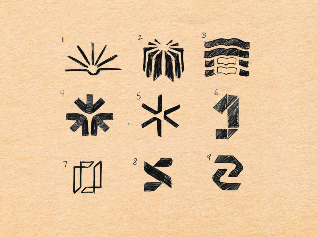
- 1 – 3: Using books to illustrate processes and multiple publications. We particularly liked how option 2 evoked a gear, which connected well with the workflow management ScholarOne offers.
- 4: Arrows pointing in to evoke multiple processes equaling one outcome
- 5: Merging concepts 1, 2, 3, and 4.
- 6 – 7: Incorporating the number “one” from ScholarOne’s name also with a process concept.
- 8 – 9: Incorporating the shared “S” of Silverchair and ScholarOne, evoking the existing Silverchair logo.
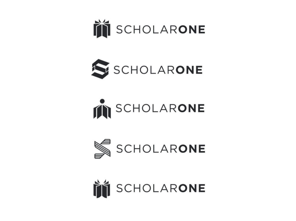
After some research and discussion, we selected a few to be developed into more final versions and also asked for one new direction that evoked the human element of ScholarOne’s offerings: peers reviewing content, the exchange of knowledge, trust and service. From there, Rob presented five final designs, from which the leadership team overwhelmingly selected our final logo.
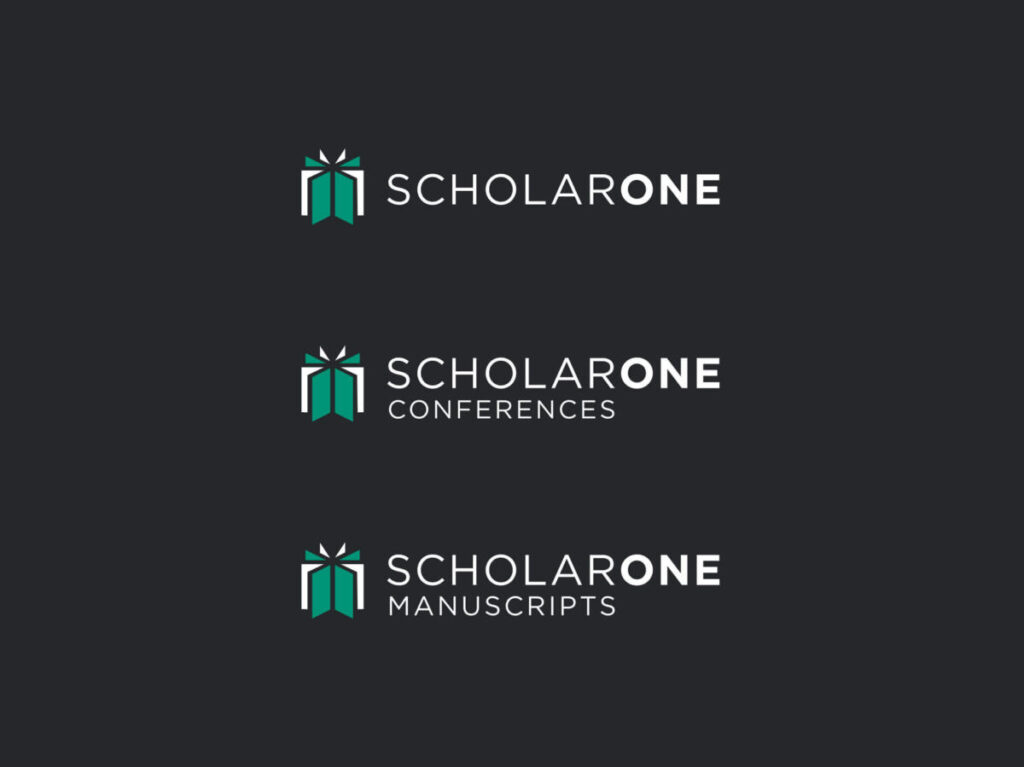
We also needed various iterations of the logo for the two products, ScholarOne Manuscripts and ScholarOne Conferences, as well as one with an endorser logo as we work to associate the two brands in the marketplace over the coming year. From there, we received the full style guide with colors, usage guidelines, and more.
The New Silverchair
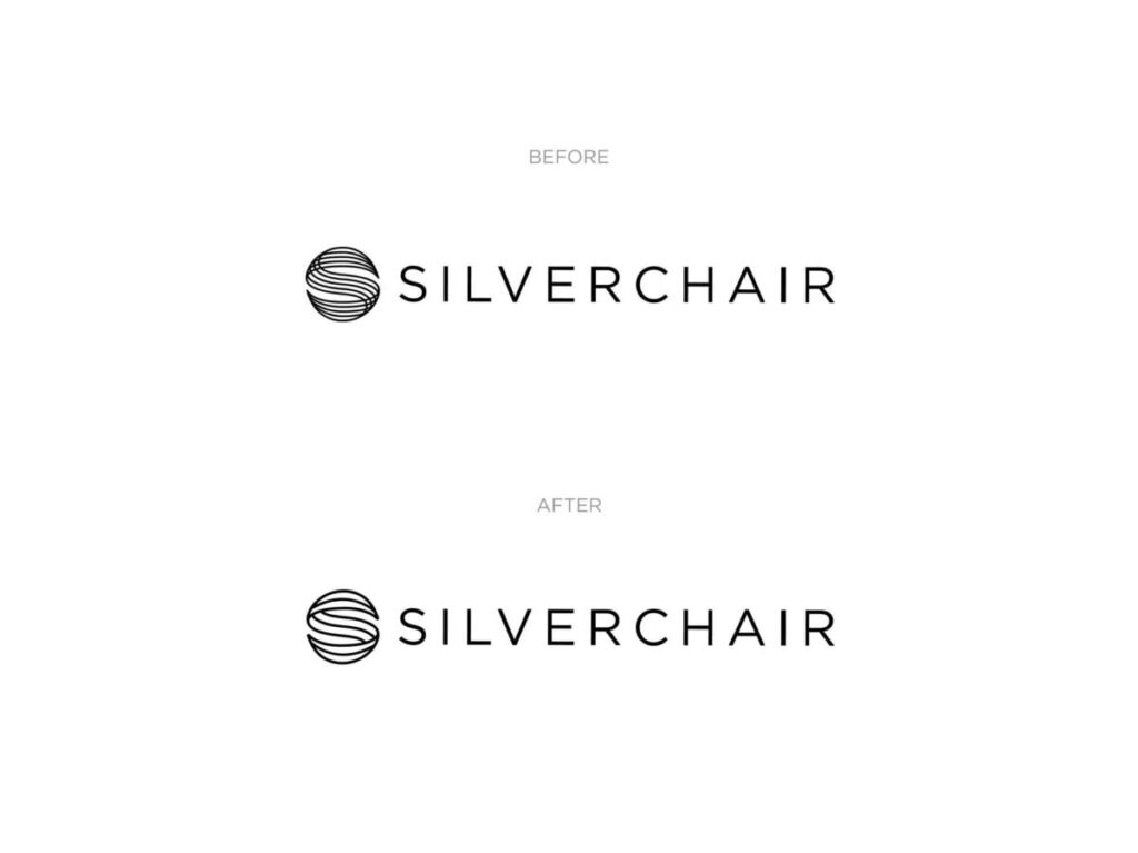
Of course, an acquisition of this magnitude is also a great time to step back and look at the entire brand and make tweaks. Rob & I had long struggled with aspects of the Silverchair logo, since its fine, tight lines would often blur when presented in a small format, like a favicon or on our popular swag pens. Maybe now was the time to finally update it? This inclination was given fuel from recent research that shows that the specifics of a logo aren’t as important as its ability to be easily recognized.So we decided it was time to give the classic logo a refresh without losing the easy recognition it’s earned over several decades. We simply took the lines from five down to three and thickened them so the logo stands out more (and more clearly so) when reproduced both digitally as well as in print.
The Silverchair Brand Family
Together, the Silverchair family of products reflects the cohesive community and service ethos of all our products while also giving each its own look and feel to reflect its individual importance for our clients and our industry. 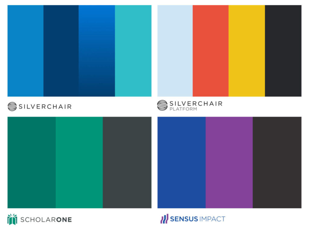
Silverchair’s goal in this acquisition is to build on the many excellent things about ScholarOne, to more broadly promote the product’s abilities and the incredible people powering it, all while extending the qualities that Silverchair is known and loved for – and we think the updated branding reflects that.